GitLab is an open-source DevOps platform which provides Git repositories management, continuous integration, issue tracking, and other features. Self-managed GitLab can be installed on the own server.
This tutorial explains...
Unicode characters are represented by a unicode code points. Code point is an integer between 0 and 1114111 (10FFFF - hexadecimal number). Unicode code point is often represented as U+...
While working with data, we might need to perform various operations. For example, to count number of elements in an array. A table includes a links to posts with examples...
Dataset can be provided in various file formats. Kaggle supports CSV, JSON, BigQuery and SQLite database file format. Files can be compressed using the ZIP or other common file archive...
Let's say you didn't know the exact dataset identifier. Kaggle allows searching datasets via API by providing keyword, tags, file type, license or owner. Kaggle API returns paginated results. In...
Metadata provides additional information about dataset in Kaggle. It includes elements such as description, title, subtitle, keywords, licenses, total downloads, and other.
Kaggle API client provides the metadata_get method to...
Kaggle allows to download various public datasets. Each dataset has an identifier which consists of owner and dataset name. Let's say you want to download the Iris dataset. This dataset...
Kaggle is a platform that offers machine learning competitions, allows making submissions, download public datasets, and more. Kaggle has a large community of data scientists and machine learning engineers. We...
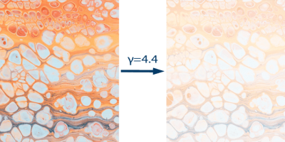
Images can look either too light or too dark. Gamma correction is a method that allows to control the brightness of an image. The formula used to get a gamma...
While working with text processing we might need to make the first letter uppercase and the rest lowercase in a string. A table includes a links to posts with examples...